Singapore Institute of Management
A unified university website, serving three key user needs.
Role:
UX Researcher and Designer
Activities:
Stakeholder interviews, landscape review, discovery interviews, personae, user journey, user flows, information architecture, wireframing, usability testing
Tools:
Miro, UXPin
Sections:
01 / Summary
Project brief:
The Singapore Institute of Management (SIM) is shifting its focus from just undergraduate education to becoming a lifelong education provider that caters to all ages.
To achieve this, the new website aims to unify SIM’s three business arms into a single platform, offering a cohesive and efficient experience that meets the diverse needs of its users.
Preliminary results:
Our content personalisation implementation increased our visitors’ consideration of applying, with a range of 1.8% to 9.0% uplift in click-through rate for different application forms.
Improvements in site speed results (average of mobile and desktop across 3 pages)
Google Pagespeed Insights Performance Score: Average score improved by 30%.
Google Speed Index: improved by 36%.
02 / Understanding the problem
In this section:
- Stakeholder Interviews
- Landscape Review
- Discovery Interviews
- User Personae and Journeys
Stakeholder Interviews:
Before diving into user research and ideation, it was essential to first align on business goals and requirements. These discussions helped ensure a shared understanding of the new website’s objectives and set the stage for clear expectations. We also gathered valuable insights into the target audiences and peers to conduct the landscape review.
Key learnings:
Defining SIM’s Identity:
The new website must convey SIM’s role as a lifelong partner throughout all stages of life while emphasising how SIM stands out from and adds value compared to autonomous universities.
Target Audiences
The website must serve a broad audience ranging from 18 to 88 years old, including:
- Prospective international students
- Prospective local students
- Parents of prospective students
- Prospective PMEs and their HR departments
- L&D directors, C-suite executives, and HR teams from corporates
- Current students seeking further academic progression
- Agents representing international students
Website Improvements
- Clearer Value Proposition
- Content should feel conversational and engaging, not robotic
- Showcase student clubs, campus experiences, and ensure the content is rich but not overwhelming
- Reassure parents of prospective students about the quality of education and campus safety
- Highlight SIM’s partner universities and their role in the Global Education (GE) offerings, while showcasing SIM’s unique value proposition
Landscape Review:
With a good understanding of the business and expectations, we proceeded to study the landscape. We focused on six key criteria and analysed 20 websites, including five autonomous universities and 15 private institutions.
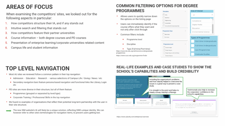
Key learnings:
Information architecture
We found a gap in the landscape regarding the representation of a holistic, long-term educational partnership within website structures.
While many websites offer persona- and task-based navigation, we found no examples that successfully combine these features with the representation of an institution’s “education partner across all life stages” offering.
This presents an opportunity for the new SIM website to develop a unique Information Architecture (IA) that both reflects its long-term educational partnership with users and addresses the diverse needs of its audience. The IA will be a tailored solution that embodies SIM’s distinct identity.
Campus life & student information
We found that showcasing the vibrancy and safety of the campus environment is a key area of interest for both students and their parents.
These are the common content types to do so:
- Statistics that emphasise the school’s USPs
- Virtual tours
- User-generated content
Additional useful content:
- Detailed information about the school’s location to reassure prospective international students and parents about the safety and quality of life in the area
- A “chat with current students” feature to provide first-hand insights into school life and courses
Intuitive search and filtering Solutions
With a wide range of undergraduate and professional development courses, a powerful search and filtering functionality is essential for users to find relevant options. We found examples of sites that successfully implement this with:
- Predictive search suggestions
- Relevant filter options, such as career paths and skills acquired
- Clear presentation of search results
- Related content recommendations
Discovery Interviews:
In collaboration with SIM, we identified seven distinct target audiences for the website. From this list, we worked together to prioritise the primary audience for user research, with the understanding that addressing their needs would also address the majority of secondary audience needs.
I conducted remote user interviews with three key primary user groups (due to COVID-19 restrictions):
Prospective students (or early first-year students)
Prospective PMEs or Parents of prospective students
HRD, L&D directors, or C-suite executives from corporate organisations
Research Objectives:
How do users independently research and evaluate schools and courses? What factors influence their decisions?
What is the current perception of SIM’s brand and website experience?
What specific goals or information do users seek when visiting the SIM website?
Were users able to find the information they needed?
What challenges or frustrations did users encounter on the current website?
Given the distinct nature of the three user groups, the interview questions were customised to gather insights relevant to each group’s needs and behaviours.
Here are some findings:
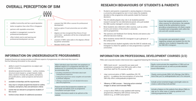
Interview Insight #1: Perception of SIM
Many users were unaware that SIM offers courses for professional development.
SIM was perceived as a backup option when local universities were out of reach.
There was a general perception that degrees from SIM were less recognised than those from local universities, which may impact employability and earning potential.
Users were unaware of the added value SIM provides through its partnerships with local and international universities.
Some users mistakenly confused SIM with SUSS (Singapore University of Social Sciences).
Interview Insight #2: Research Behaviours of Students & Parents
Students primarily relied on online forums and reviews for research.
SIM’s Instagram was used to explore campus life.
Students chose the programme; parents handled the financial decisions.
For many locals, SIM was a second choice due to lower entry thresholds or missed application deadlines, though it was seen as the most reputable PEI in Singapore.
International students and parents chose SIM based on recommendations and considered Singapore’s education quality, safety, and cultural fit.
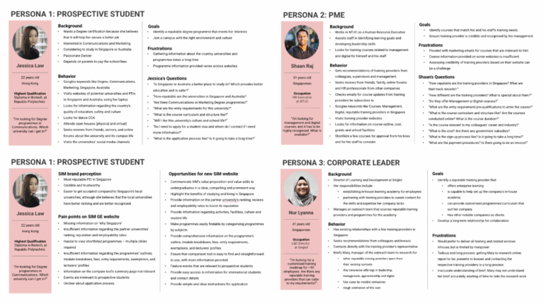
User Personae & Journeys:
Based on insights from the discovery interviews and survey results, I developed 3 target user profiles: Jessica (Prospective Student), Shaan Raj (PME), and Nur Lyanna (Corporate Leader).
Documenting personae allowed me to better empathise with the primary user groups and prioritise goals aligned with their needs.
Mapping out the user journeys for each persona further deepened my understanding of their full experience, uncovering key gaps and opportunities that guided the solutioning stage.
03 / Ideate
In this section:
- Task Flows
- Information Architecture & Navigation Sitemap
- Wireframes
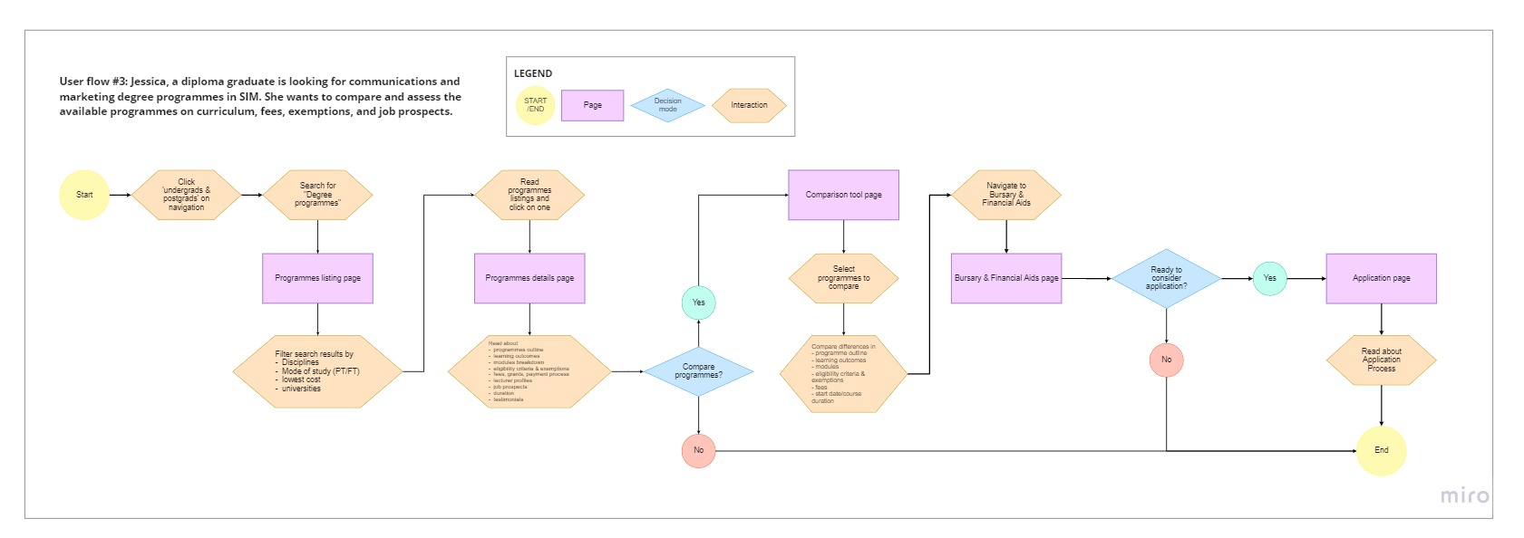
Task Flows:
To visualise and better understand the individual steps users take during their journey, I created task flows. This process was instrumental in shaping and finalising the Information Architecture.
The scope for task flows was limited to five, so I focused on creating flows for five key website tasks across the three personas. To identify the most relevant task flows, I considered the primary goals of each persona.
For both prospective students and PMEs, the key task was finding courses, assessing their suitability and understanding campus life. For corporate organisations seeking enterprise learning, their goal was to find out SIM’s education academy and customisation options.
Here is an example:
Information Architecture:
Based on the research insights, I defined the Information Architecture (IA) for the new SIM website, and was later evaluated during usability testing with users.
The main goal of the new IA was to ensure that the needs of all three user personae were equally prioritised and presented.
I proposed an IA structure split into three main user groups. This way, each user group can focus only on the content that’s relevant to them, simplifying navigation and improving the overall user experience. The IA was created on Miro but converted to a presentation deck for the clients.
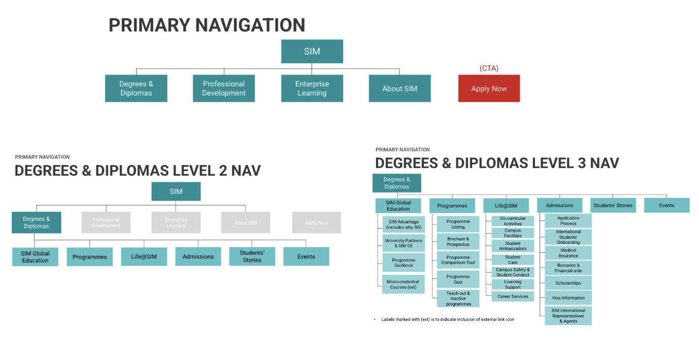
Here’s how I designed the navigation based on the IA:
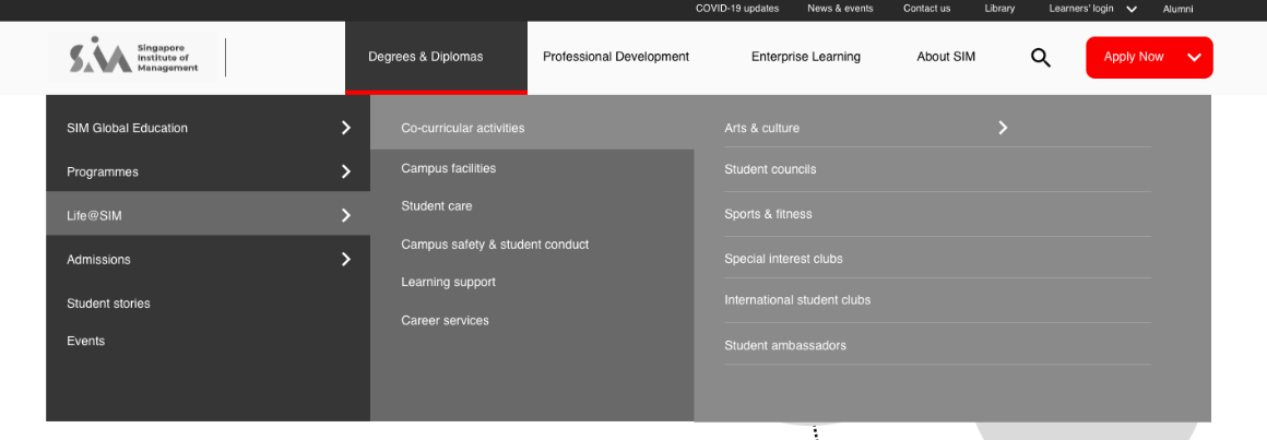
Wireframing:
I prioritised the pages to be designed based on their importance to the personae, referencing their task flows. This was because we needed to prioritise key functionalities and content for usability testing.
For each page, I outlined the relevant persona and goals, defined the content structure, and designed the layout to align with those objectives. This approach ensured the pages met persona needs and provided a solid rationale for presenting the wireframes. The wireframes were created in sprints.
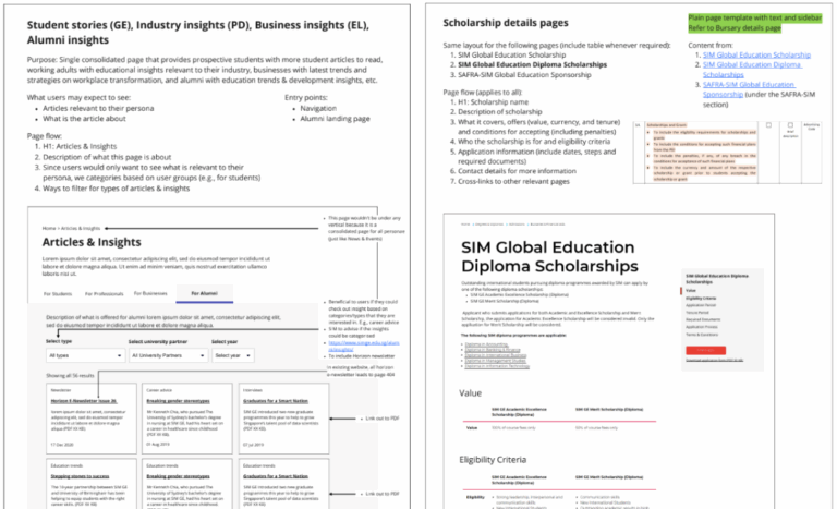
Here are some of the key functionalities wireframed:
Designed the homepage masthead to immediately convey SIM’s three offerings by visually connecting the three personae to each other, resembling lifelong learning.
Included a section on the homepage that explains more about SIM’s three offerings/personae, giving relevant content to each persona.
Created a programme listing page for prospective students to see available programmes, with filters and a comparison functionality to help narrow their selections.
Planned and designed the programme details page based on information users seek, and implemented a side sticky bar with anchorlinks and key calls-to-action so that users can easily access any section.
04 / Validate
In this section:
- Usability Testing
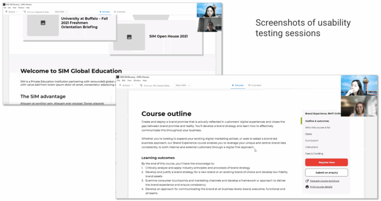
Usability Testing:
After designing the key pages, I planned the testing, created hypotheses and tasks, and conducted one-on-one virtually. The project scope was limited to six testing sessions.
I compiled the findings into a report, summarising key insights and next steps. Proposed changes were presented, aligned with clients and updated on the wireframes.