The National Gallery Singapore
The website as an Art Pusher to inspire and guide.
Role:
Lead UX Researcher and Designer
Activities:
Stakeholder interviews, landscape review, secondary research analysis, appeal testing, personae, user journey, user flows, information architecture, tree testing, wireframing, usability testing
Tools:
Figma, Figjam, UXTweak
Sections:
01 / Summary
Project brief:
The National Gallery Singapore aims to redefine and develop a new website that engages both the non-art engaged and art-engaged audiences by offering a holistic yet seamless experience throughout their journey with the Gallery. The website also aims to showcase its significant collection of Singapore and Southeast Asian modern and contemporary art.
What was done:
Conducted a thorough landscape review of 57 websites to understand industry standards and identify opportunities for innovation.
Adapted the UX research process to the client’s needs, shifting from first-hand research to utilising secondary research and turning it into actionable insights.
Developed a Sort-and-Prioritise (HEART) methodology to test for user appeal and ensure alignment with user expectations.
Simplified the navigation by reducing excessive sub-levels and tree-tested the Information Architecture with 60 respondents, yielding successful results.
Wireframed over 100 pages, carefully planning each page’s content structure for optimal user experience.
Conducted iterative usability testing across 6 rounds, involving 80+ users, refining the layout with each iteration.
Planned and designed the e-commerce functionality, including 13 scenarios and flows.
Preliminary results:
The new website launched in December 2024, and a preliminary data study showed:
30% increase in online revenue
11.38% increase in organic search conversion rate
24% increase in organic search
272% increase in total time spent on art collections pages
02 / Understanding the problem
What do the users need and want? What happens if the client says “Do you need to conduct more research? Can you use our past survey findings?”
In this section:
- Stakeholder Interviews
- Landscape Review
- Secondary research analysis
- User Personae and Journeys
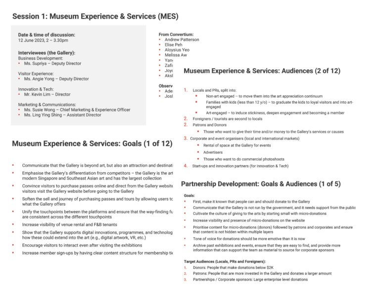
Stakeholder Interviews:
We spoke to five business units and gained insights into their website KPIs.
We learned about their pain points, future goals, and user feedback. These sessions also helped us better understand the website’s target audiences, providing more specific user archetypes beyond psychological traits like non-art engaged and art-engaged.
We identified 8 user personae and learned about their ideal reference sites, helping us to identify competitors for the landscape review.
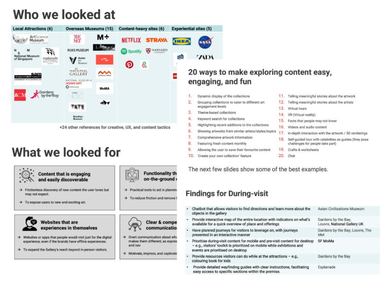
Landscape Review:
With a good understanding of the business and expectations, we proceed to study the landscape. We focused on 4 key criteria and analysed 57 websites.
We learned that there was a gap in the landscape, with many museum brands struggling to communicate a strong value proposition, lacking post-visit tools, and failing to connect their offerings. We also managed to gather 20 ways that can improve content exploration with several visit planning functionalities.
These findings later helped with the solution in the ideate stage.
Secondary Research Analysis:
We initially planned user interviews, but the client suggested leveraging their previous surveys and usability testing, as they had already invested significant effort in understanding user feedback.
We understood the client’s desire to avoid rework, so we decided to analyse their past research before deciding whether we should continue with user interviews.
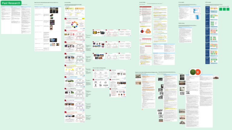
Past research highlighted users’ perceptions of the brand, pain points on the website and during their visit, and the information they sought when planning their visit.
The findings were valuable in identifying key issues and understanding user needs, so we decided against conducting additional interviews.
Here are some user feedback highlights from the past research:
“
Not meant to be offensive. Your live presentation is too superior compared to your website.
“
Hard to find upcoming exhibitions, homepage is messy and should reflect the latest exhibitions instead.
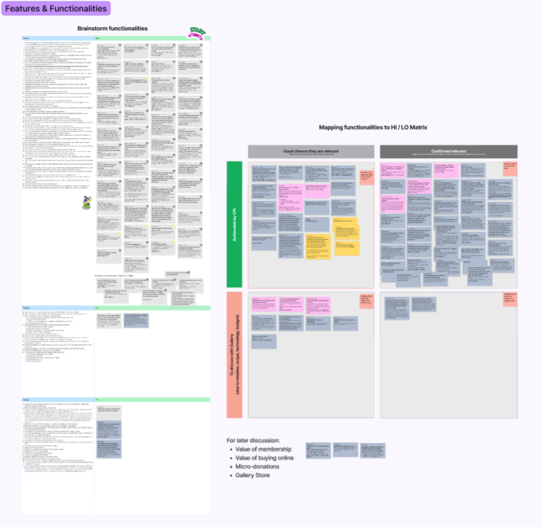
- Listed findings with relevant functionalities from the landscape review and brainstormed additional concepts.
- Organised ideas into a high-relevance/low-effort matrix to identify:
- Must-have features
- Useful options
- Feasibility discussion items
- Must-have features moved to ideation and useful features were tested for user appeal.
Here’s the fun part!
- We brainstormed various testing methods, including one with a boat, and chose the Sort-and-Prioritise (heart) methodology for its simplicity and ease of results tabulation.
- We had 14 features to test, aiming for at least 20 respondents.
- I created the testing board template, ran internal dry runs and training, and gathered real examples to demo each feature.
- To speed up testing, we focused on personal contacts matching the eight personae.
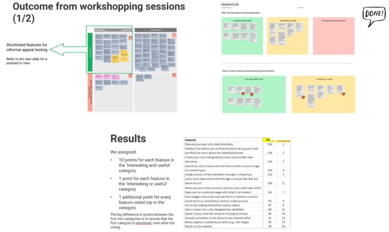
3 features emerged as clear winners from the appeal testing and were added to the ideate stage:
1st
Planned journeys with clear directions
(156 points)
2nd
A tool that allows you to find directions during your visit and find out more about the exhibits/artworks
(138 points)
3rd
Create your own self-guided journey and provide clear directions
(136 points)
User Personae & Journeys:
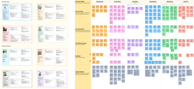
We created 8 user personae, divided into primary and secondary groups.
Due to scope and timeline constraints, we focused on mapping the user journeys for the 4 primary personas, visualising their experience and interaction with the gallery’s website and physical space.
This process highlighted their needs, pain points, and broader opportunities for the gallery, beyond just the website.
03 / Ideate
In this section:
- Information Architecture & Navigation Sitemap
- Tree Testing
- Wireframes
Information Architecture:
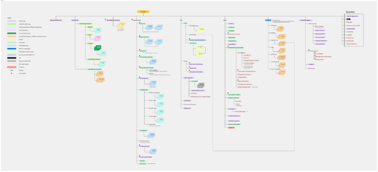
With the client’s goals and research findings, I had a clear vision for the Information Architecture (IA).
The IA is organised around key aspects of the gallery’s business, the content they want to highlight, and user needs, aligning with both the gallery’s objectives and user expectations.
Once the IA was set, navigation was developed based on this structure. While not identical, a well-structured IA ensures intuitive and seamless navigation.
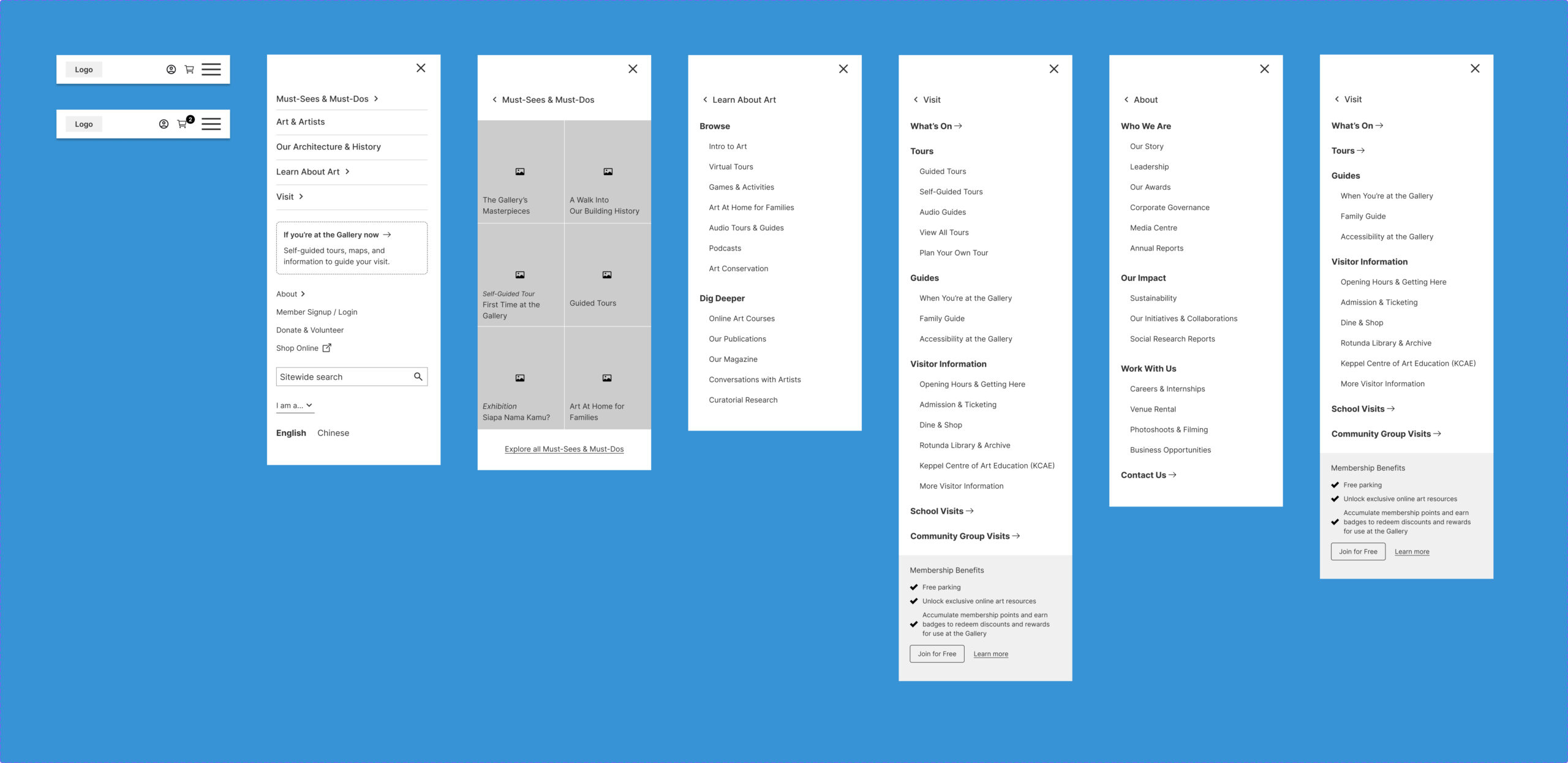
Here’s how the navigation was structured and designed: the concept focused on balancing content exploration with easy access to practical information.
Tree Testing:
After finalising the Information Architecture, the next step was to validate it by testing how users interacted with the structure and if they could easily find information within the hierarchy.
This step was crucial, as a weak foundation would lead to navigation issues, no matter how polished the design.
We tested with 60 respondents across the 4 primary personae.
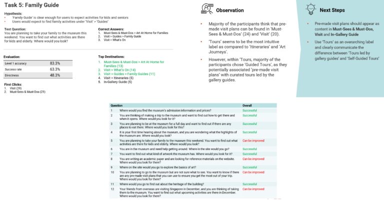
Overall, the information architecture was proven successful with a few improvements to be made or taken note of:
#1 change
Use ‘Tours’ as an overarching label and clearly communicate the difference between ‘Tours led by Gallery guides’ and ‘Self-Guided Tours’.
#2 change
Include upcoming activities in Must-Sees & Must-Dos for more visibility.
#3 change
Rename ‘Shop’ in the navigation to ‘Shop Online’ to make it clear that it refers to the e-commerce store.
Wireframing:
I prioritised the pages to be designed based on their relevance to the primary personas, focusing on the most important pages first.
For each page, I outlined the relevant persona and their goals, defined the content structure, and designed the layout to align with those objectives. This approach ensured the pages met persona needs and provided a solid rationale for presenting the wireframes. In total, I wireframed over 100 pages.
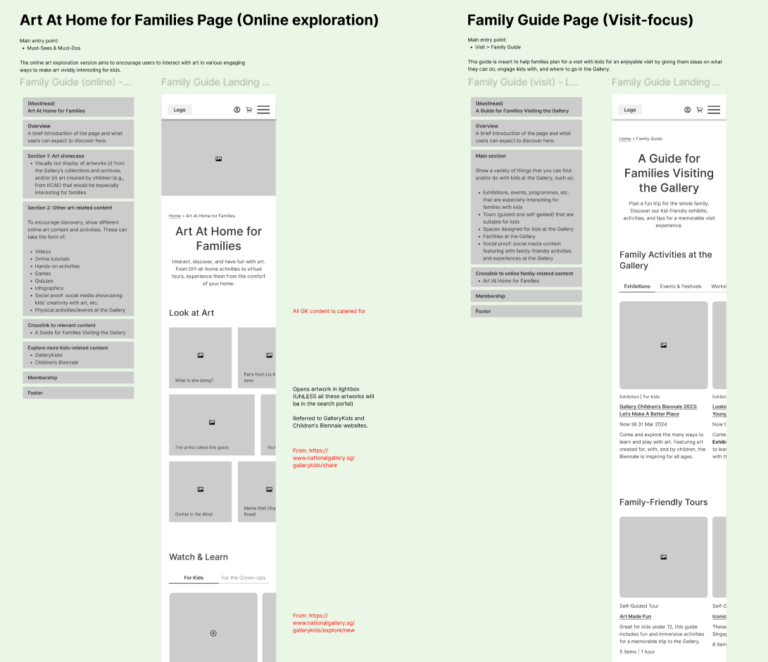
Here are some of the key functionalities wireframed:
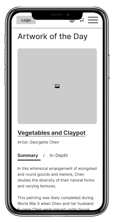
Introduced the ‘summary’ and ‘in-depth’ options for the artwork description on the homepage, to make art relatable to both art-engaged and non-art-engaged audiences.
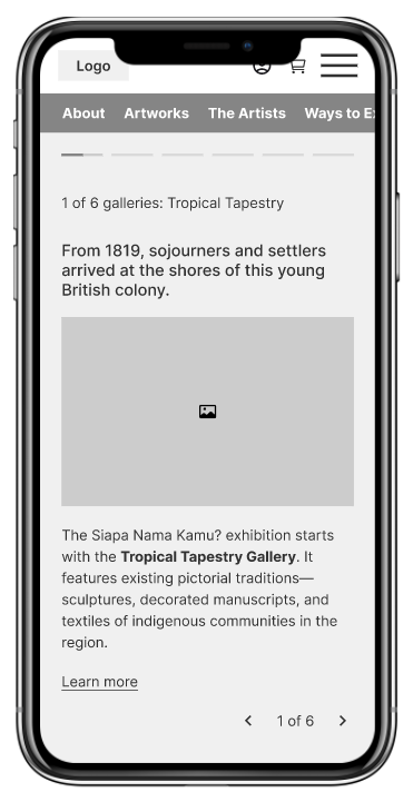
Consolidated sub-galleries into bite-sized content, eliminating the need for sub-level pages within the exhibition page.
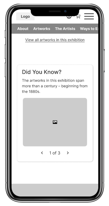
Introduced fun facts related to the exhibition to make art easy to learn and enjoyable.
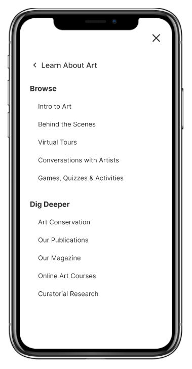
Extended the visit experience with online art resources, split into beginner (intro to art, games & quizzes, virtual tours) and intermediate (publications, curatorial research) content.
Introduced an in-gallery guide functionality (from appeal testing) to help users navigate the gallery, addressing the issue of feeling lost and providing guidance during their visit.
Renamed ‘art journeys’ to ‘self-guided tours’ (based on tree testing), redesigned the layout with step-by-step directions to each exhibit or activity, and introduced a ‘Create your own tour’ feature for users to customise their experience based on their interests.
Created a family guide, catering to families as a key persona, allowing parents to access all visit-related content for their kids on a single page.
We simplified the purchase process by allowing users to add activities to their cart, with the system recommending the appropriate passes. For advanced users, a direct pass purchase option was also provided.
04 / Validate
In this section:
- Iterative Usability Testing
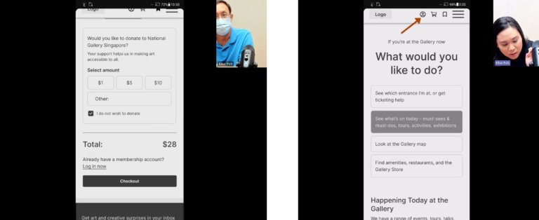
Iterative Usability Testing:
After designing the primary personae pages, I planned the first round of testing, created hypotheses and tasks, and conducted one-on-one in-person sessions.
I compiled the findings into a report, summarising key insights and next steps. Proposed changes were presented, and preparations for the next round of testing began. This process was repeated for each round, refining the design based on feedback.
In total, 4 pre-launch rounds (38 respondents) and 2 post-launch rounds (43 respondents) were conducted, with certain functionalities introduced in phases.
Each round resulted in an improved design version.
